previous logo
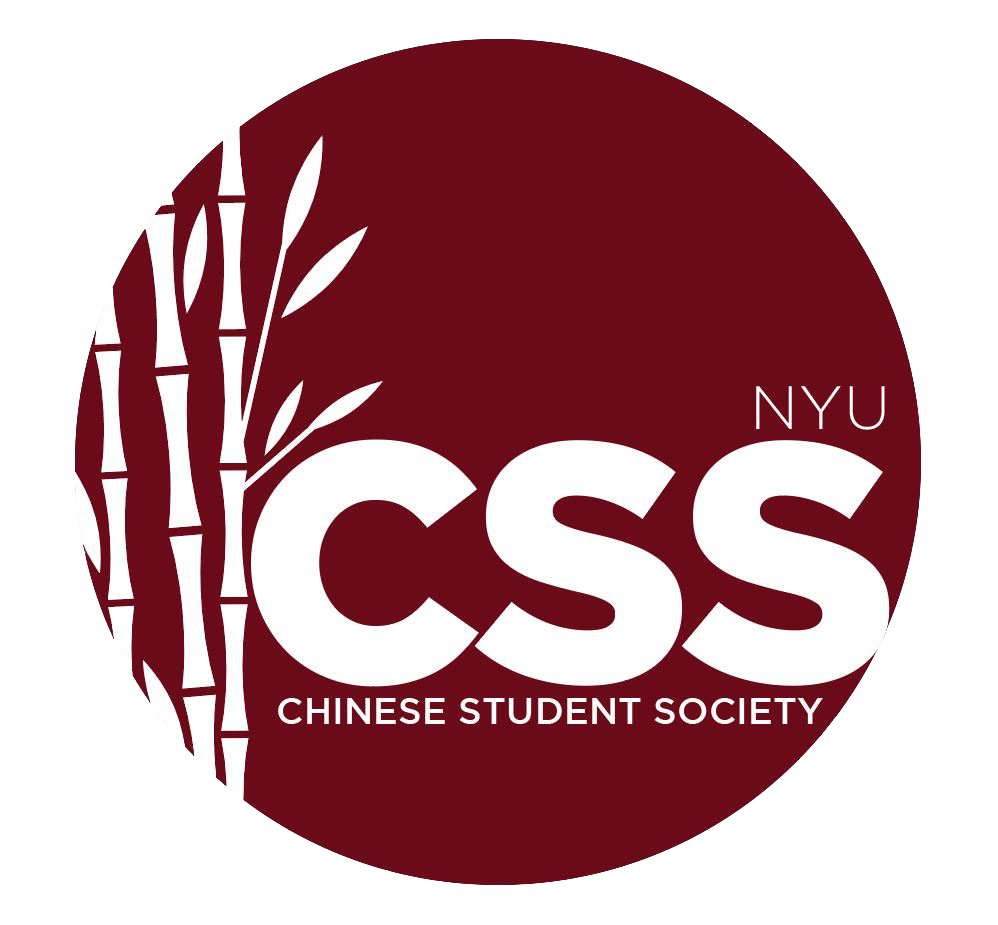
Previous CSS logo (2018-2020)
Objective
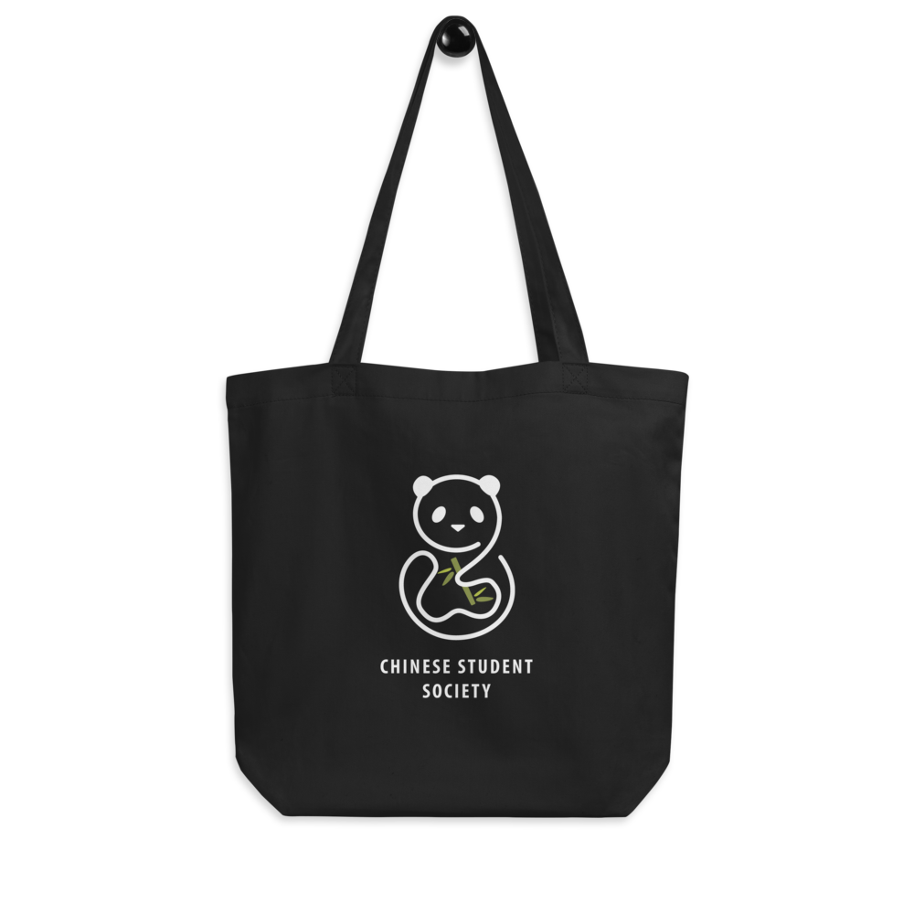
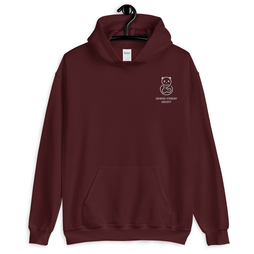
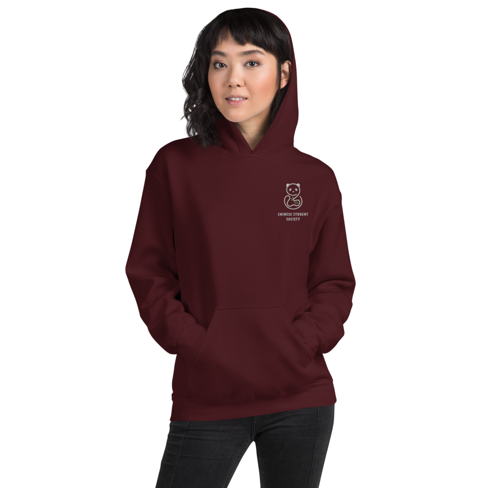
As graphic designer of the Chinese Student Society at NYU, I was asked to perform a redesign of the logo to be used on all the club's social media and marketing from 2020 and onward.
Because we were considering creating wearable merch at the time, I wanted to create a logo that would read well on printed/embroidered merchandise, and would be visually appealing enough for people to want to wear it, regardless of their affiliation with the club.
I felt that the old logo had too many small textual elements that would not be very legible on merch; and although it served its purpose well as a logo, it seemed too text-based for people to want to wear.
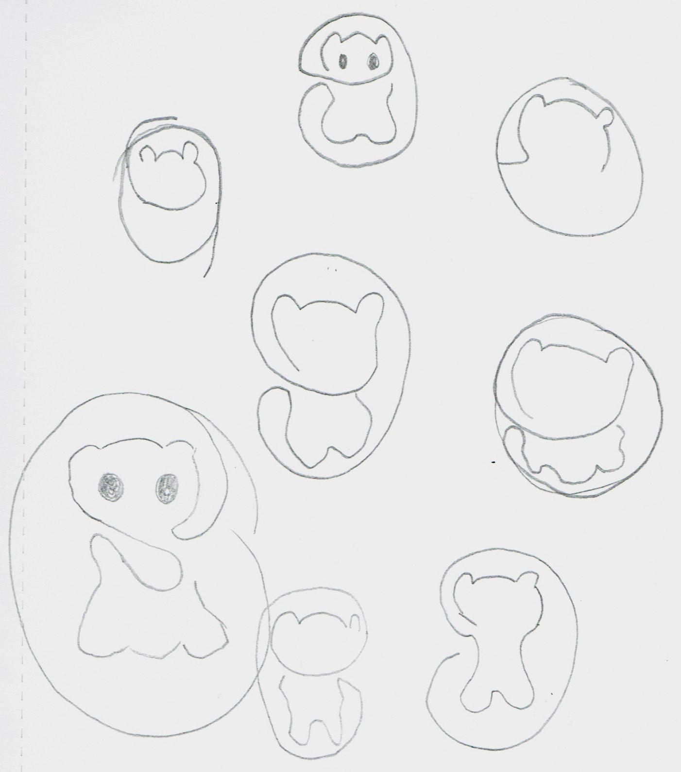
sketches
For the redesign, I decided to focus on minimalism and form. I was heavily inspired by line-art, and believed that it would be the most efficient way to achieve a clean, minimal look.
The panda was a common motif in prior CSS logos, so to maintain the CSS branding, I decided to stick with the panda, but go for a single-stroke, line-art interpretation of it.
The panda was a common motif in prior CSS logos, so to maintain the CSS branding, I decided to stick with the panda, but go for a single-stroke, line-art interpretation of it.
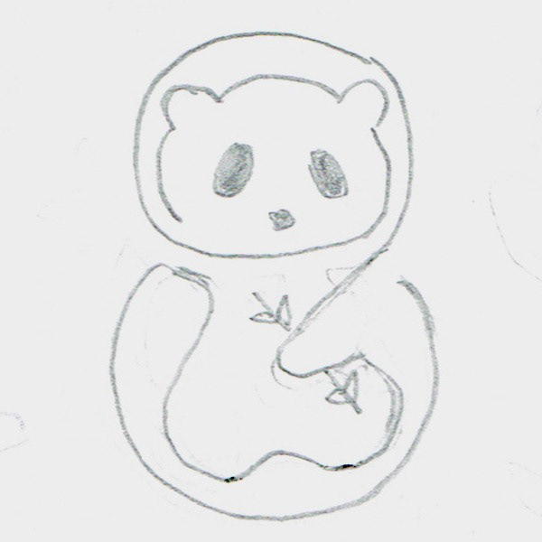
initial iterations
second to last iteration
redesigned logo